Link
Follow
About Me
Показаны сообщения с ярлыком interface. Показать все сообщения
Показаны сообщения с ярлыком interface. Показать все сообщения
вторник, 29 сентября 2009 г.
 New position for buttons Maximize, Close, Minimize
I again welcome you on the blog! Today speech at us will go that more convenient it is possible to think up with buttons to "Close", "Maximize", "Minimize". It would Seem that it is possible to make with these three buttons. From year to year, from one in other operating system they accompany us. But... all the same there is more logical for them a place.
Look at a Fig 1. On it the usual panel of problems is displayed, but it does not nestle to right and to a left edge. Now we will virtually open a window (a file browser or any program). The result is displayed on Fig. 2.
The picture contains except the button panel at the left and on the right. It is more logical to Close the button to place on the right. The user mechanically lasts today to the right to close a window. The button to develop (or to curtail) is at the left.
On Fig. 3 the moment when the mouse cursor is over the button is displayed. It increases in size (by the same principles which I described in the previous post). I will continue to come up with ideas and ideas which at me appear. Watch a blog.
I will be glad to cooperation with the company to which my ideas are interesting. Ahead work with the button form, the panel of problems and other. Also I will analyse the interface of your program, I will prompt useful decisions for improvement of appearance and convenience of users.
Fig. 1
Look at a Fig 1. On it the usual panel of problems is displayed, but it does not nestle to right and to a left edge. Now we will virtually open a window (a file browser or any program). The result is displayed on Fig. 2.
Fig. 2
Fig. 3
On Fig. 3 the moment when the mouse cursor is over the button is displayed. It increases in size (by the same principles which I described in the previous post). I will continue to come up with ideas and ideas which at me appear. Watch a blog.
I will be glad to cooperation with the company to which my ideas are interesting. Ahead work with the button form, the panel of problems and other. Also I will analyse the interface of your program, I will prompt useful decisions for improvement of appearance and convenience of users.
понедельник, 28 сентября 2009 г.
 New concept file explorer by Alex B
Hello!
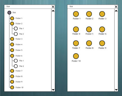
I use computer 15 years yet. At first time i see Windows Explorer in 1995 year. In this time the file explorer has not changed. On Fig. A I have represented schematically our favourite browser.
It consists from Window Name, central part with list of files or folders and auxiliary elements for list control.

Fig. A
On a court yard of 21 centuries and thechnology have left fat forward. I offer the next prinсiples of File Explorer.
Prinсiples of file explorer
1. Files and Folder for user is data.
2. All near at hand.
3. Operation System is arranged for the user.
4. Operation System is trainded.
5. The logic of display of the data is adjusted by an operation system on the basis of filters which are set by the user.
I represent the version of a explorer.

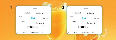
Fig. 1. Simple view files and folders. Main Folder (Disk) is in center.
Folders and Files are around it. In the bottom part of window there are filters which are included by options (A...Z - by Alphabet, Size...size - by Size, T...t - by Date and Time).
Fig. 2. The left and right arrow serve for rotare on clock and counter-clockwise the list of files if them it is not visible in a windows. Arrows becomes more active at cursor leading.

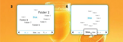
Fig. 3. Folder (or Files) align by Alphabet.
Fig. 4. Show preselect options. The user does not need to guess availability of switching.

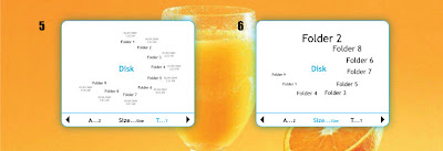
Fig. 5. Show Folders and Files by Time. Grey text is created or changed date of Documents (this function can be adjusted to the user - for example color, font and size of date and time).
Fig. 6. Folder (or Files) align by Size. The greatest folder is above (this function can be adjusted to the user - for example by hour pincinle).
Thus, the user receives new tools which improve his life. If you were interested by the given idea you can communicate with me for its completion and realisation in what or the project.
Alex B.
Подписаться на:
Сообщения (Atom)


